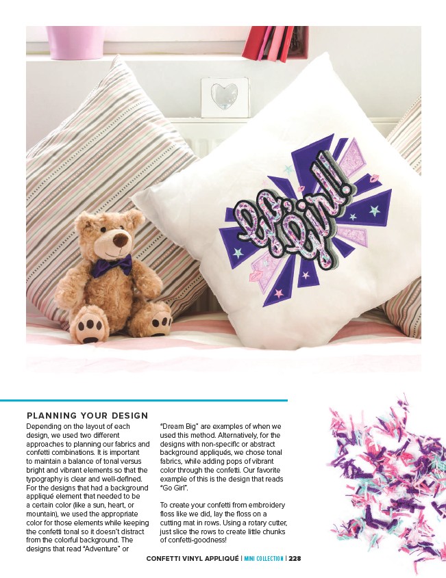
PLANNING YOUR DESIGN
Depending on the layout of each
design, we used two different
approaches to planning our fabrics and
confetti combinations. It is important
to maintain a balance of tonal versus
bright and vibrant elements so that the
typography is clear and well-defined.
For the designs that had a background
appliqué element that needed to be
a certain color (like a sun, heart, or
mountain), we used the appropriate
color for those elements while keeping
the confetti tonal so it doesn’t distract
from the colorful background. The
designs that read “Adventure” or
“Dream Big” are examples of when we
used this method. Alternatively, for the
designs with non-specific or abstract
background appliqués, we chose tonal
fabrics, while adding pops of vibrant
color through the confetti. Our favorite
example of this is the design that reads
“Go Girl”.
To create your confetti from embroidery
floss like we did, lay the floss on a
cutting mat in rows. Using a rotary cutter,
just slice the rows to create little chunks
of confetti-goodness!
CONFETTI VINYL APPLIQUÉ | MINI COLLECTION | 228