PROJECT 100
Choosing the correct fabrics will make the designs pop!
Karlie's Cards | Anita's Express 100th Edition | 32
MARCH 2019
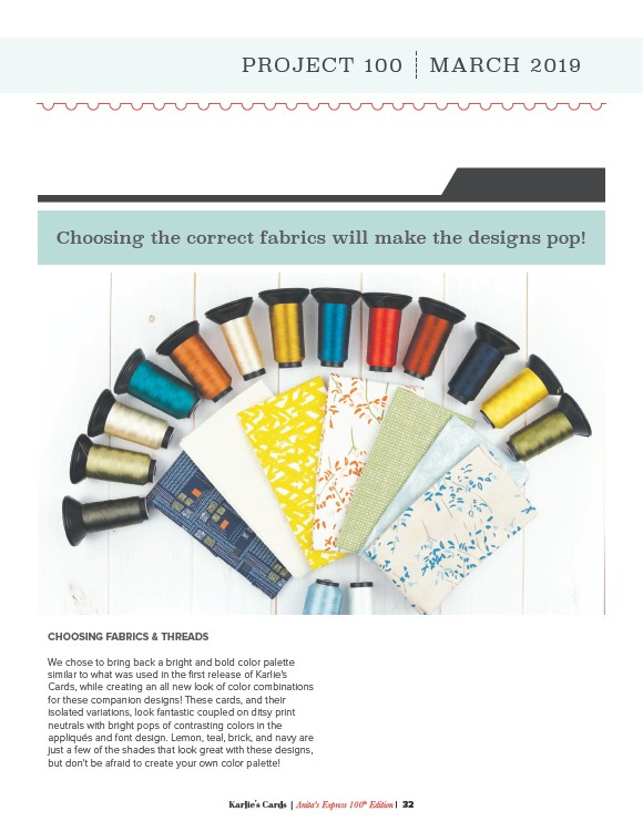
CHOOSING FABRICS & THREADS
We chose to bring back a bright and bold color palette
similar to what was used in the first release of Karlie's
Cards, while creating an all new look of color combinations
for these companion designs! These cards, and their
isolated variations, look fantastic coupled on ditsy print
neutrals with bright pops of contrasting colors in the
appliqués and font design. Lemon, teal, brick, and navy are
just a few of the shades that look great with these designs,
but don't be afraid to create your own color palette!