Vibrancy
COLOR STORY
For a bright and fresh punch to any wall, this palette combination is sure to do the job. Drawing
inspiration from the leaders of the Fauvism movement, avant-garde artists like Matisse and Derain
employed bold pops of blue and pink, among other vivid primary and secondary tones. Wilson's
development of this color story arose from the wonderfully citrus shade of orange commonly associated
with luxury brand Hermès. The bold hues are then married with neutral white undertones and can
bring the perfect play on color to a variety of the techniques in this series. Add in the saturated tones
with care as to not overwhelm your wall with too much of any single shade, and use neutrals like white
or light gray throughout.
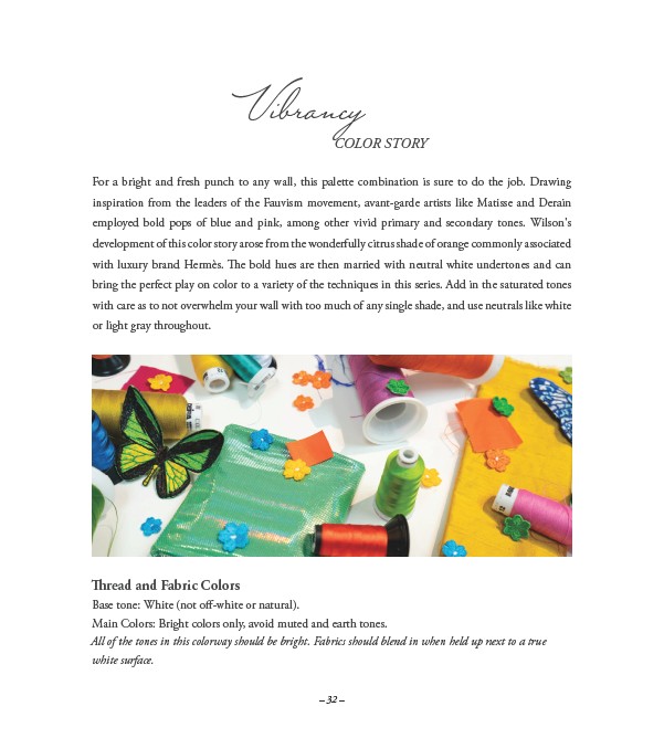
Thread and Fabric Colors
Base tone: White (not off-white or natural).
Main Colors: Bright colors only, avoid muted and earth tones.
All of the tones in this colorway should be bright. Fabrics should blend in when held up next to a true
white surface.
– 32 –